AI Character Chat
At Wrtn, I worked on the AI platform, which has grown to over 5 million monthly active users, along with its AI character chat services. The following three case studies showcase some of the key product challenges I tackled while designing and launching these experiences.
Pick your language:
Case Study 1
Visual Novel Redesign
Case Study 2
Input Field AB Testing
Case Study 3
Image Studio


Case Study #1
Redesigning the Visual Novel Experience Around the Limits of AI Generation
Team
1 PM, 1 Designer, 3 Engineers
Role
Sole Product Designer
Timeline
Nov-Dec 2025, Mar-Apr 2026
Platform
Web, iOS, Android
Overview

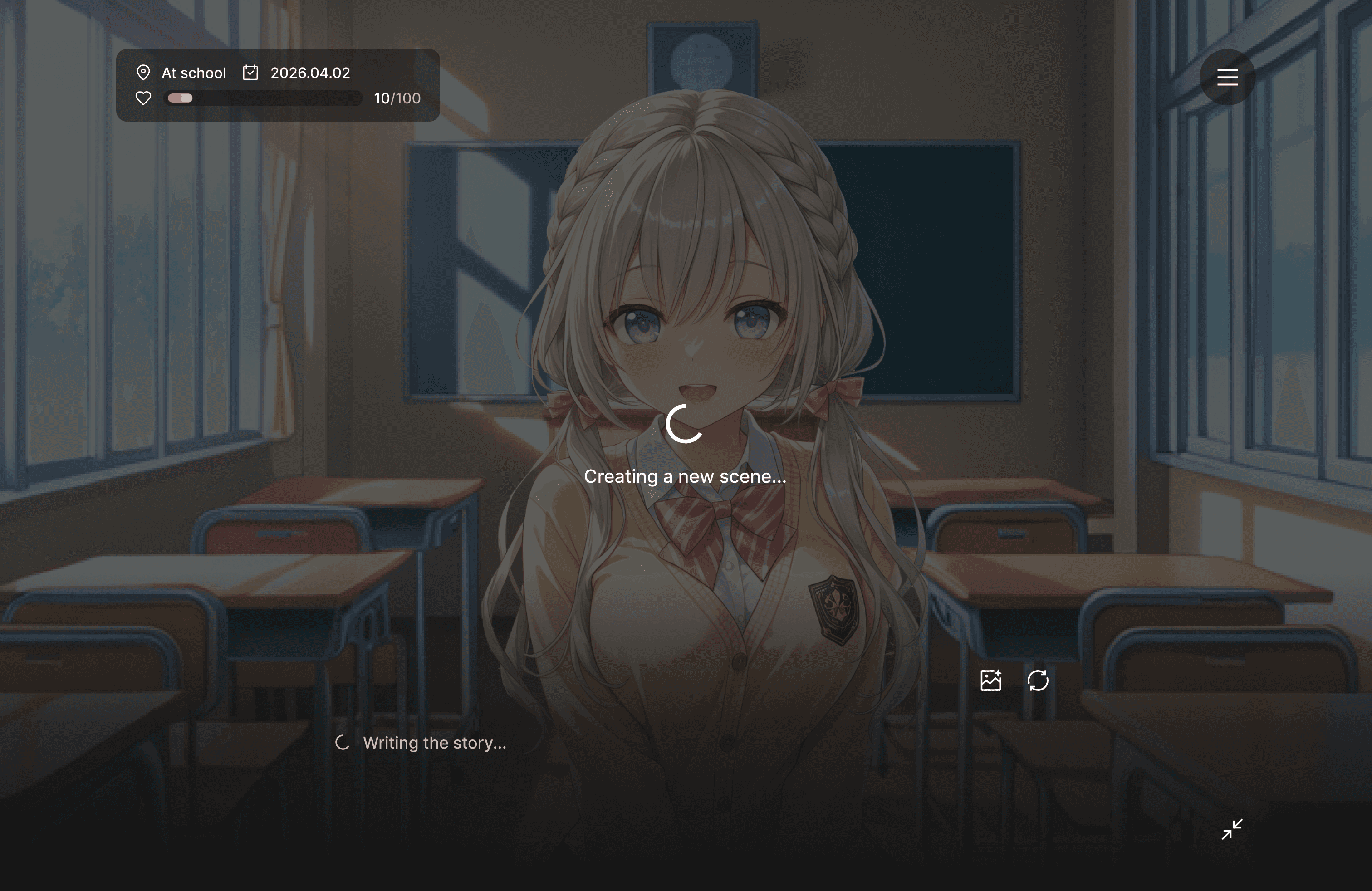

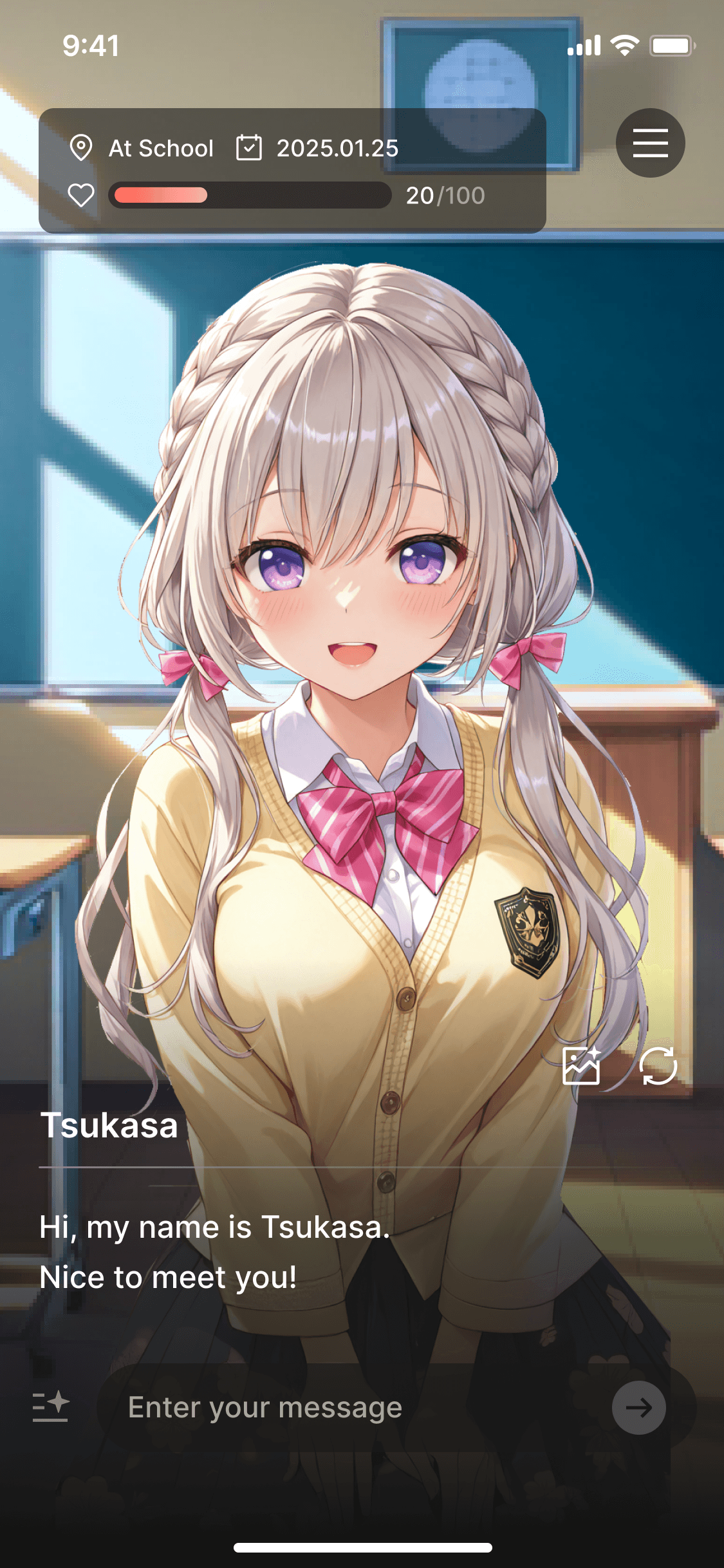
Kyarapu is an AI character chat service that Wrtn launched in Japan following the success of Crack in Korea. While exploring ways for Japanese users to enjoy more immersive AI-powered content, we saw an opportunity to create a visual novel experience where images and story progressed together, similar to a dating simulation game.
This idea was grounded in user behavior data. Kyarapu already included a feature that generated scene images for each chat message, and Japanese users were using this feature far more frequently than Korean users. I interpreted this as a strong signal that Japanese users placed greater value on experiences that combined storytelling with visuals, rather than text-only conversations.
Based on this insight, I proposed expanding image generation into a fully integrated content experience. The first version of the Visual Novel feature launched in December 2025. It generated a new image at every turn of the conversation, allowing users to experience an evolving story as they chatted.
Despite the team’s high expectations, the initial results fell short. We then turned to user data and qualitative feedback to understand what was disrupting immersion and identify how the experience could be improved.
The Problem
Post-launch analysis made it clear why the feature fell short of expectations.
Average scene generation time
10 - 15 secs
Average conversation length
~20 turns per user
Drop-off rate
Significantly higher than in the standard chat experience
Each image took more than 10 seconds to generate. Given that users typically engaged in conversations of around 20 turns, this resulted in several minutes of cumulative waiting time. The repeated delays disrupted the flow of the story and became a major barrier to immersion.
User Research
To better understand the issue, I interviewed six creators who had used the Visual Novel feature. Four of them identified the long image generation time as the biggest source of friction.
“I usually end up leaving because the wait feels too long.”
“It’s even more frustrating when I wait and the image still doesn’t turn out the way I wanted.”
Through interviews and behavioral analysis, I found that creators cared less about having AI generate images automatically and more about maintaining consistent visual quality that matched the world and scenes they had in mind. This preference was especially strong among highly active creators, who favored a more controlled workflow over generating a different image every time.
In other words, the core issue was not just generation speed. The combination of long wait times and inconsistent image quality made it difficult for creators to maintain control over the stories they wanted to tell.
Insights
Based on the research findings, I distilled the problem into three key challenges.
Beyond Speed Optimization
Reducing generation time depended on model and infrastructure improvements, so the design challenge was to find a UX solution beyond technical optimization.
Creator-Uploaded Assets
Allowing creators to upload their own assets enabled faster image delivery while maintaining consistent character and background quality.
Clear Usage Guidance
The key challenge was helping users understand when to use uploaded assets and when to rely on AI generation.
The Solution
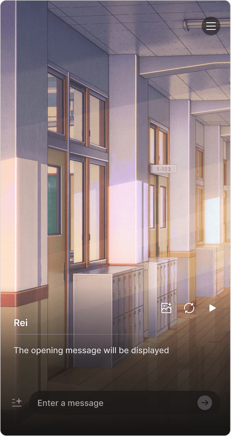
I designed the system to prioritize creator-uploaded assets before falling back to AI generation. By allowing creators to upload image assets in advance, we were able to reduce generation time while maintaining consistent character and background visuals.
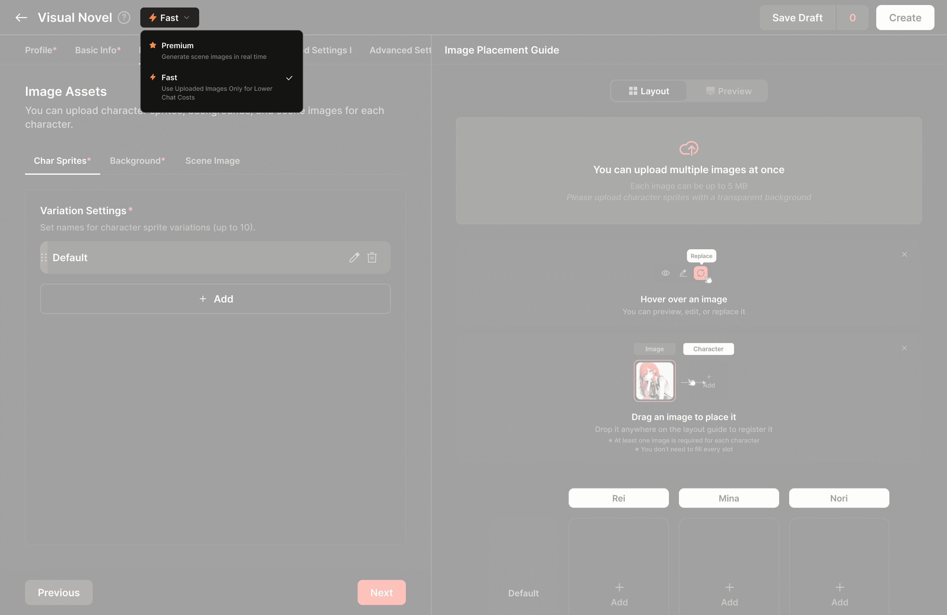
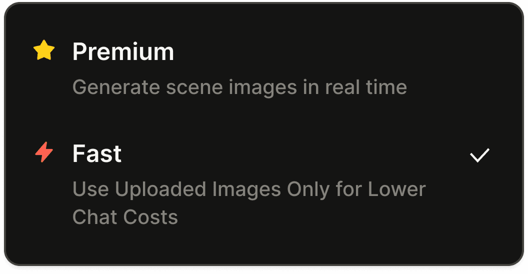

Designing Mode Selection in the Visual Novel Builder
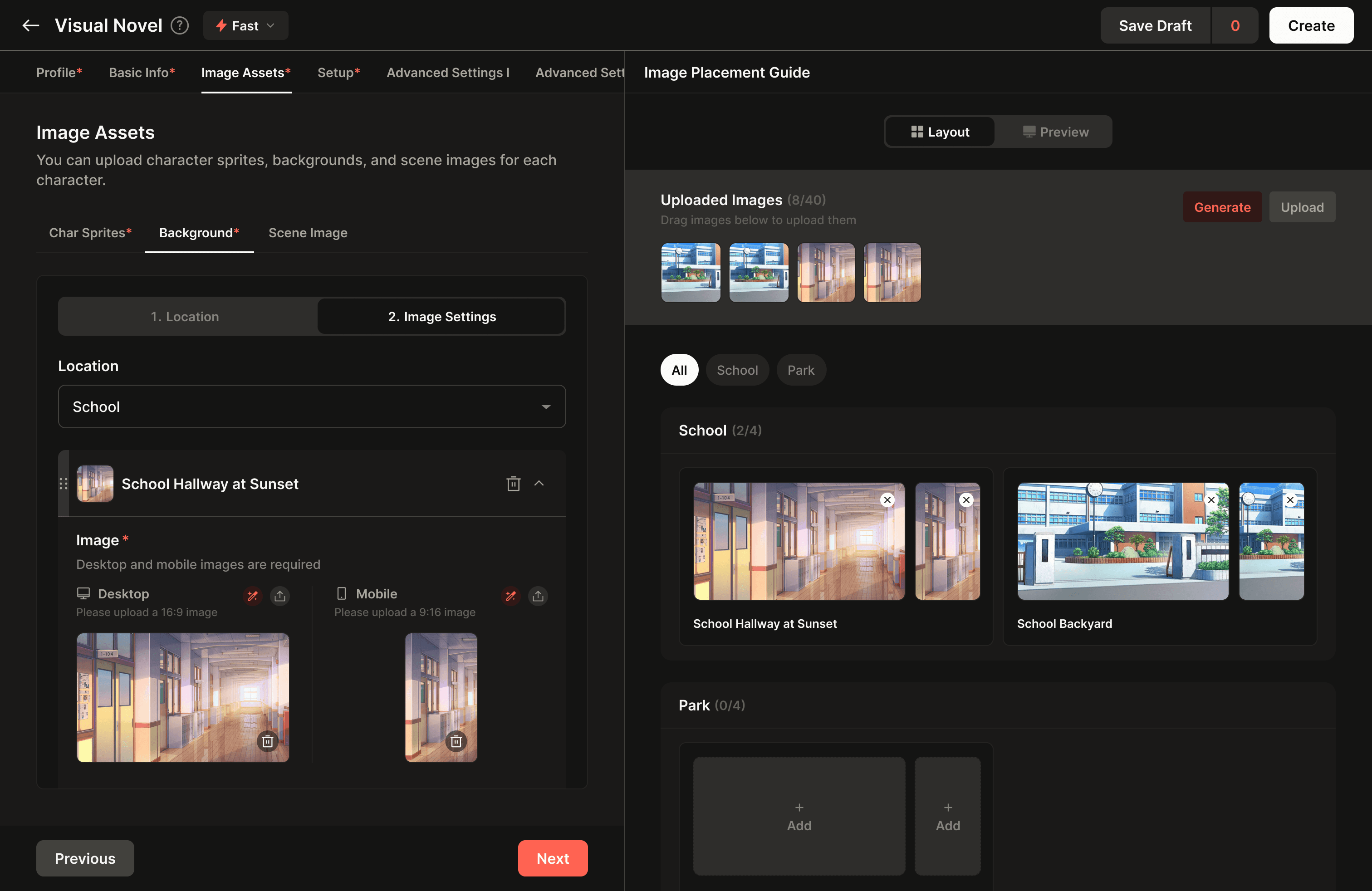
I added a dropdown to the existing builder, allowing creators to choose between Asset Mode and AI Generation Mode based on their needs.

Structuring the Asset Library Experience
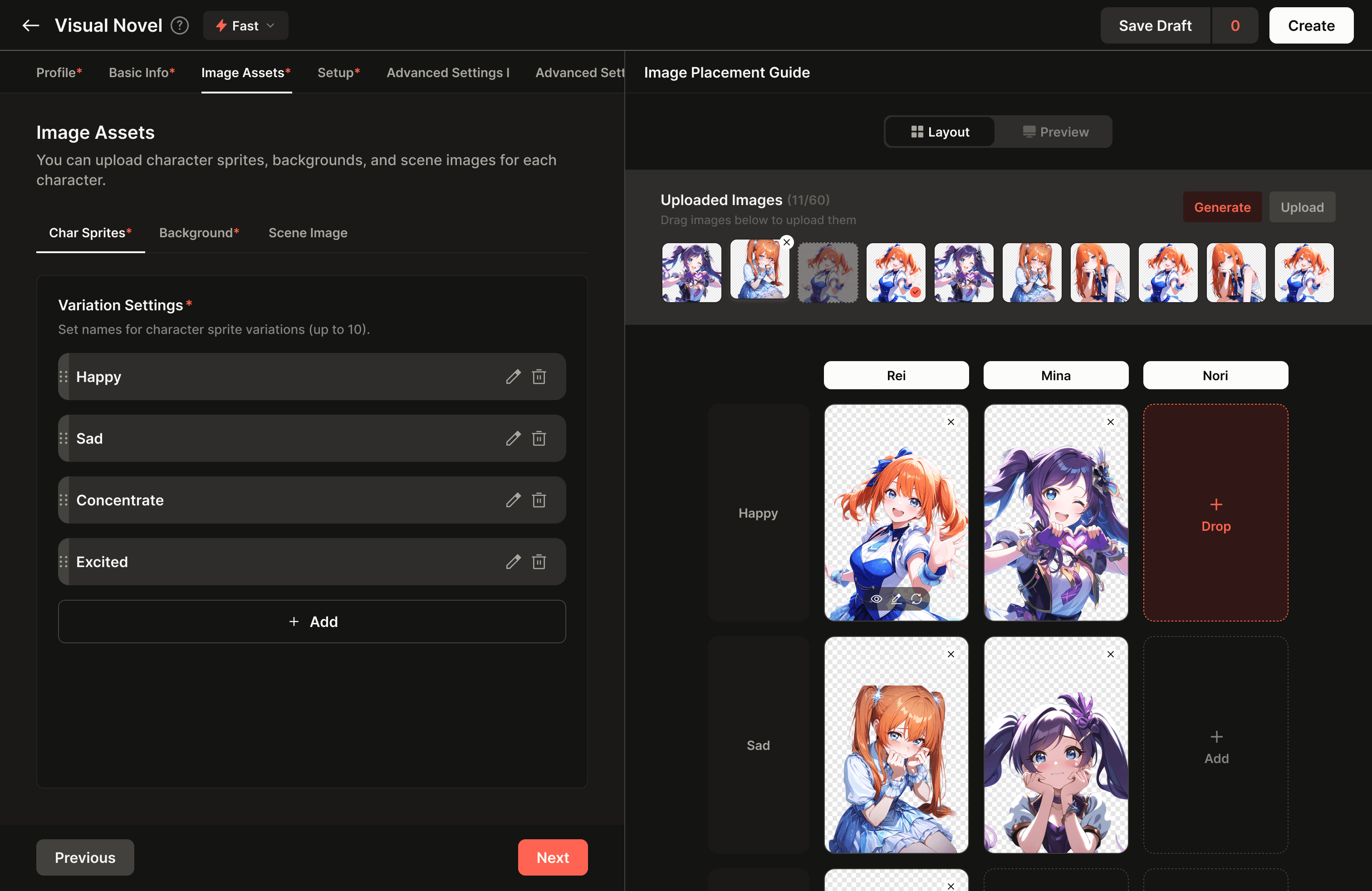
I designed the asset library to let creators upload and manage character expressions, poses, backgrounds, and scene images, giving them full control over building their own worlds.
Implementing a Drag-and-Drop Editing Experience
I designed a drag-and-drop interface that let creators easily place and organize uploaded assets by category, making large image libraries intuitive to manage.
Impact
~5sec
Loading Time
15+%
Cost Savings
Higher
User Satisfaction
Reflection
Latency was not just an infrastructure problem.
What initially appeared to be a backend issue was also solvable through UX design. By redesigning the user flow, we were able to significantly improve the experience without relying solely on technical optimization.
The default experience was more effective than explanatory copy.
We experimented with different instructions to explain the two modes, but presenting the right assets by default proved to be a much more effective way to guide users.Short-term and long-term solutions require different approaches.
In the short term, adding a mode switch within the existing builder was the most practical solution. In the long term, I believe asset-based creation and AI generation should evolve into more clearly separated experiences.
Case Study #2
Improved ARPU through a data-driven redesign of the chat input
Team
1 PM, 1 Designer, 3 Engineers
Role
Sole Product Designer
Timeline
Feb 2026 (AB Testing 2 weeks)
Platform
Web, iOS, Android
Overview
The chat input is the most frequently used interface in Kyarapu. Users interact with characters through this area dozens of times a day, which means even small changes to the input can have a direct impact on both user experience and revenue.
In February 2025, I led a full redesign of the chat input and created three interface concepts (A, B, and C). We ran a two-week A/B/C test to evaluate each approach. Based on user behavior data, I proposed a pattern tailored to Japanese user preferences, and the final design, Version C, was adopted after delivering a meaningful improvement in ARPU.
The Problem
The original chat input consisted of a single text field. However, in character chat, user messages generally fell into two distinct categories.
Dialogue
What the user says directly to the character.
Inner Thoughts, Actions, and Narration
Descriptions of the user's thoughts, behaviors, or scene narration
Both types of input were handled within the same text field. Existing users found it cumbersome to manually format dialogue and inner thoughts each time, while new users were often unsure what kind of input was expected and how they were supposed to write it.
User Research
Working with a product analyst, I examined message input patterns and found that roughly 60% of Japanese users were already typing dialogue using 「」 quotation marks.
In Japanese novels, manga, and visual novels, 「」 is the standard convention for spoken dialogue.
This indicated that users were naturally relying on a familiar storytelling convention, which suggested that formalizing existing behavior in the UI would be more effective than introducing a completely new interaction pattern.
Insights
Based on the research findings, I distilled the problem into three key challenges.
Distinct Input Types
The interface needed to clearly differentiate spoken dialogue from inner thoughts and actions.
Natural User Behavior
Using 「」 was already an established behavior pattern among users.
Data-Driven Validation
With differing opinions across the team, quantitative testing was needed to validate the best approach.
The Solution
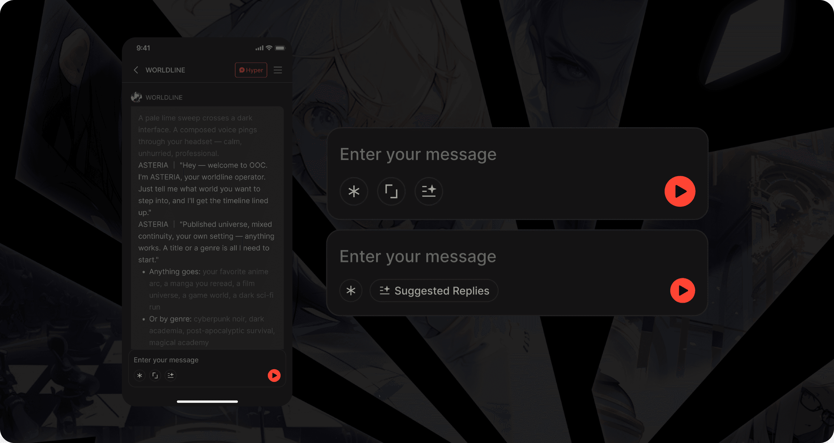
I tested three UI concepts in parallel.

Control
A single text input field, unchanged from the existing design

Variant A
Narration, Inner Thoughts (
**)
Suggested Replies

Variant B
Narration, Inner Thoughts (
**)
Suggested Replies
Dialog (
「」)
Test Setup
Duration: 2 weeks
Participants: Randomly assigned mix of new and existing users
Primary Metric: ARPU
Secondary Metrics: Button usage rate and message input patterns
What I did
Proposed Version C based on data showing that 60% of Japanese users were already using 「」 quotation marks.
Designed an A/B/C testing framework to validate the concepts objectively and address differing opinions within the team.
Used ARPU as the primary metric to measure the direct revenue impact of the UI changes.
Impact
~24%
ARPU for Variant B
Higher
User Satisfaction
Reflection
Productizing existing behavior reduces the learning curve.
Rather than teaching users a new interaction pattern, supporting behaviors they were already doing naturally proved far more effective.
Data is the strongest tool for building team alignment.
Even when intuition alone was not enough to persuade others, clear data and a well-structured experiment helped build consensus across the team.Market understanding creates product advantage.
Without a deep understanding of Japanese storytelling conventions, the idea of introducing a 「」 button likely would not have emerged. Cultural context played a critical role in shaping the UX solution.
Case Study #3
Unified Fragmented Image Generation Flows into a Single Image Studio
Team
1 PM, 1 Designer, 3 Engineers
Role
Sole Product Designer
Timeline
Apr-May 2026
Platform
Web, iOS, Android
Overview
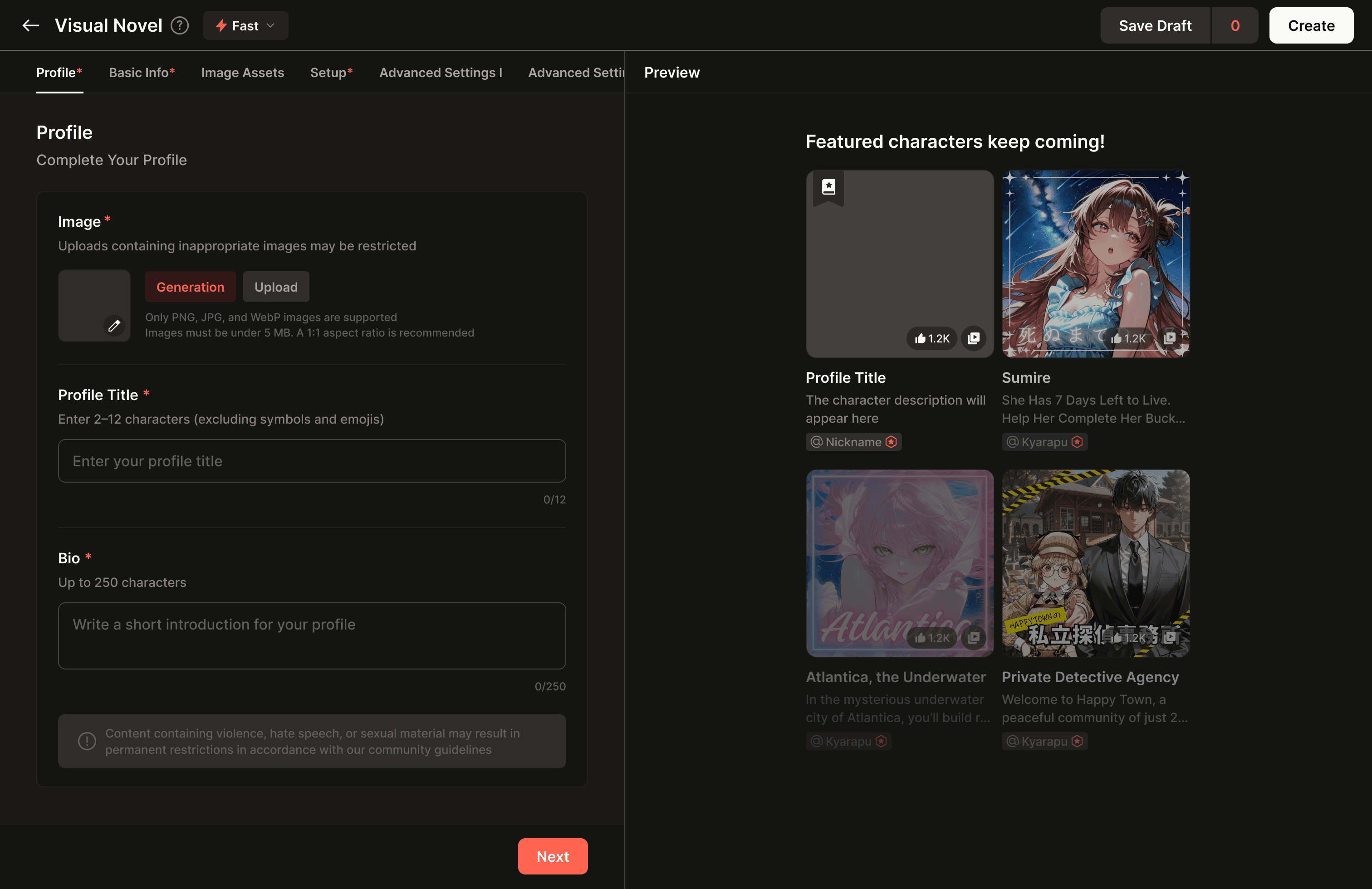
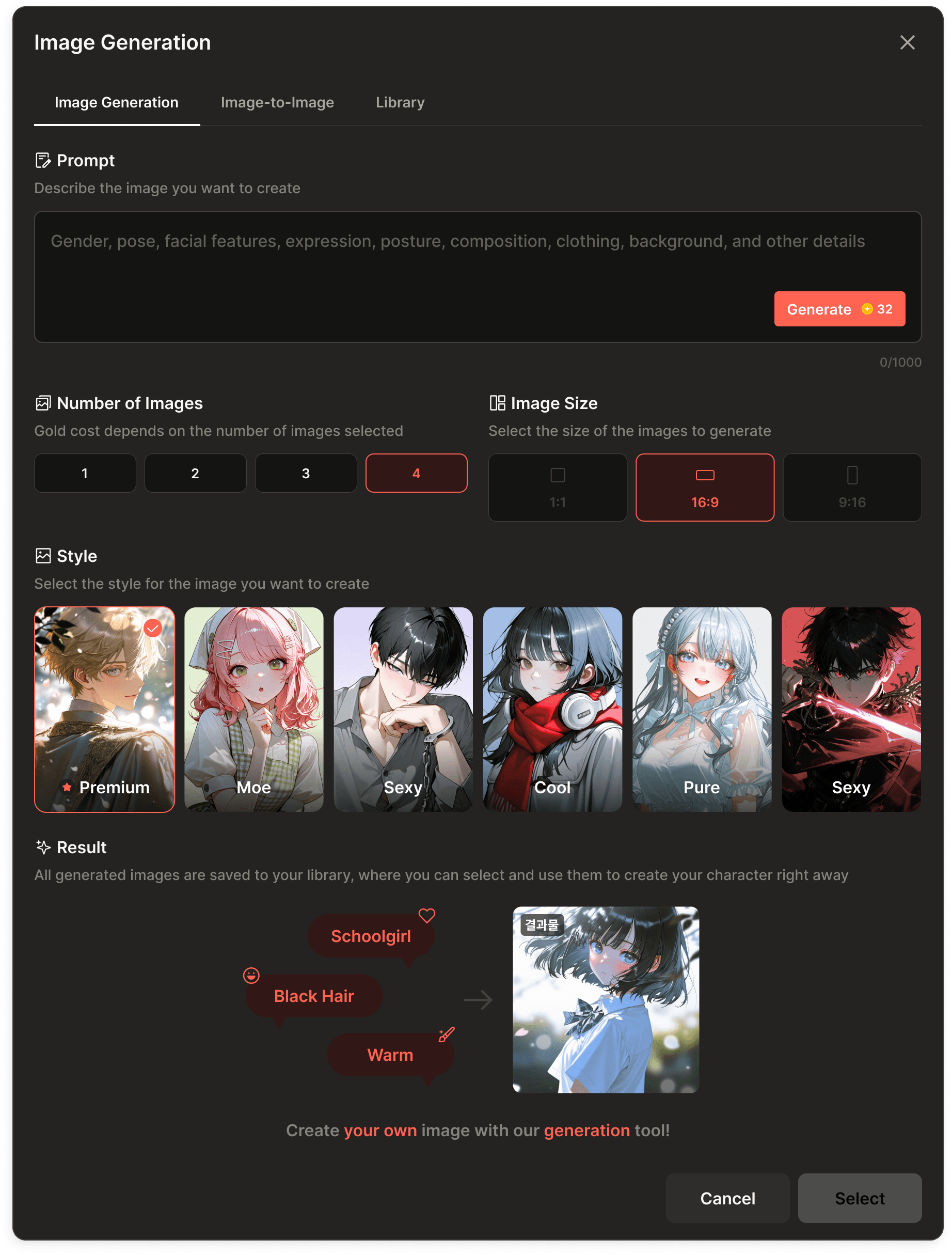

Originally, image generation was available as a modal within the builder and was primarily used by creators during the content creation process. Because we integrated the PixAI API, which was particularly strong at generating Japanese anime-style artwork, usage among creators remained consistently high.
At the same time, general users were using the same underlying technology to generate scene images during chat, and many creators were also uploading images created with external tools. In other words, demand for image generation and asset management had already been validated across multiple use cases, but there was no dedicated space that brought these experiences together.
To address this gap, I designed Image Studio, a standalone experience that unified image generation, image transformation, and asset storage into a single workflow. This allowed creators to organize production assets more systematically, while helping general users browse, manage, and reuse the images they generated more easily.
The Problem
Image generation was widely used across multiple user flows, but the overall experience remained fragmented.
Creator Image Generation
Creators generated artwork directly within the builder modal
In-Chat Scene Generation
General users created scene images while chatting with characters
External Image Uploads
Creators also uploaded images made with external tools
Users were generating and saving images for different purposes, but there was no unified experience for managing and reusing them in one place.
Personas
Creators
Creators needed to manage character, background, and scene images in a structured way while producing their works, and there was strong demand for project-based folder organization.
“I want to organize my images into folders for each project.”
General Users
Their primary goal was to generate and save images that matched their preferences, and they preferred a simple library experience over a more complex organizational structure.
“I want to save and browse lots of images, like Pinterest.”
The core challenge was designing a single product structure that could naturally support the distinct needs of both user groups.
Information Architecture
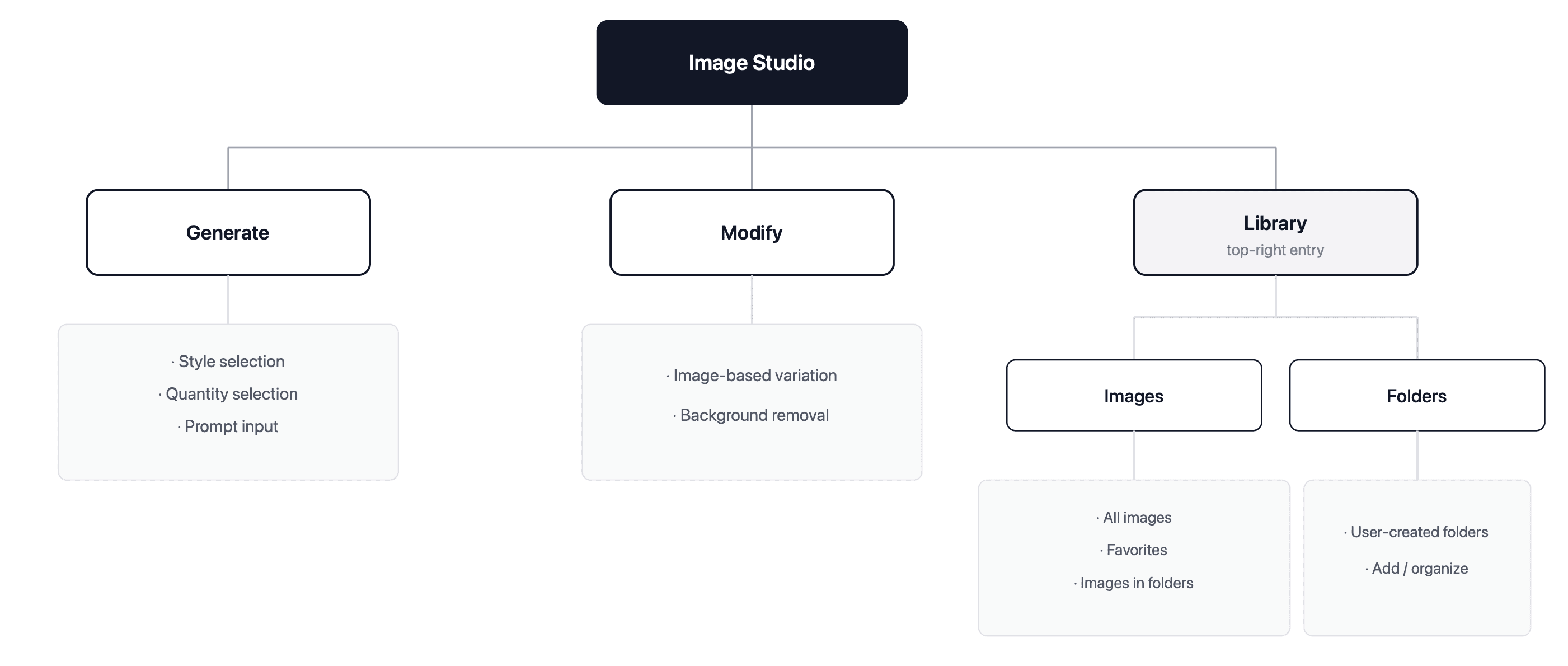
The Solution
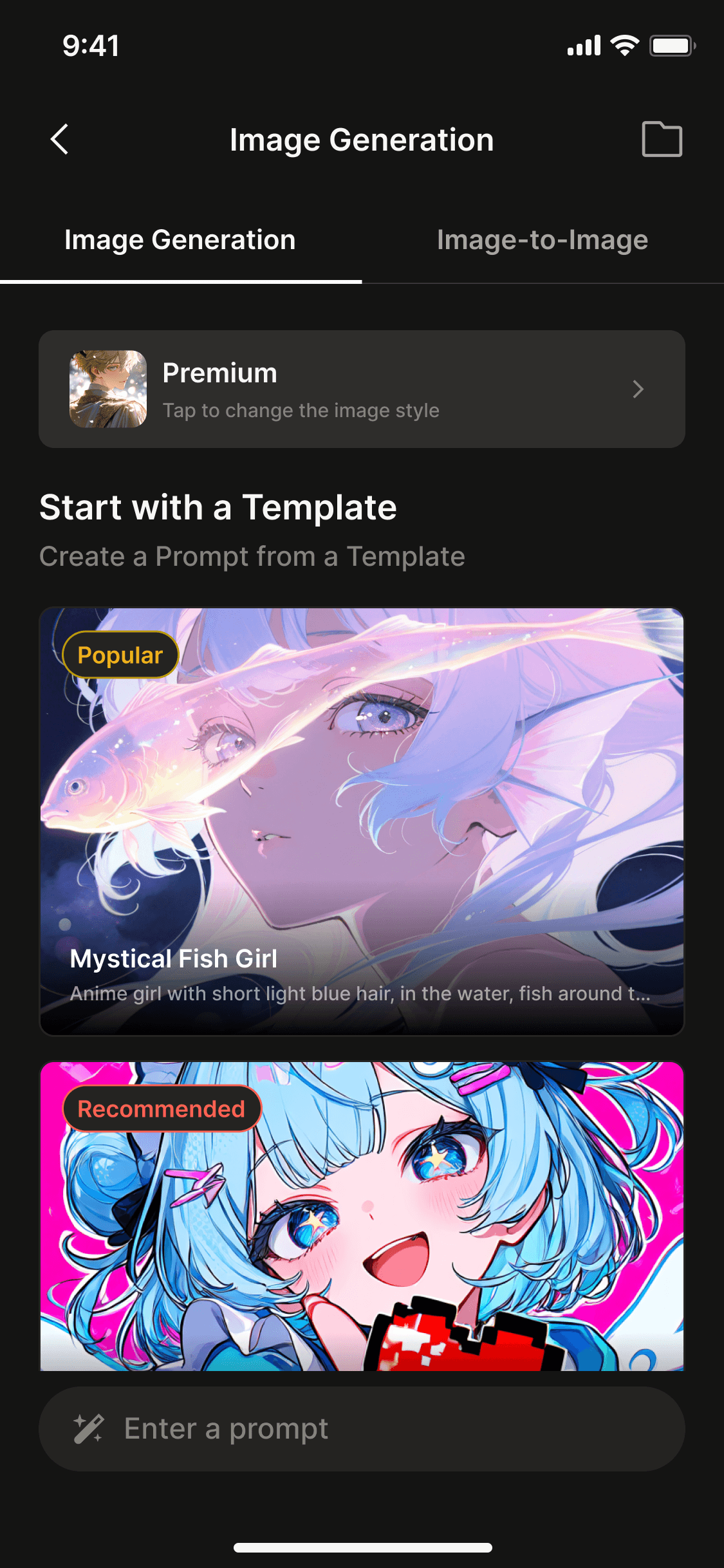
I designed Image Studio as a standalone product surface and unified image generation, transformation, and library management into a single workflow.
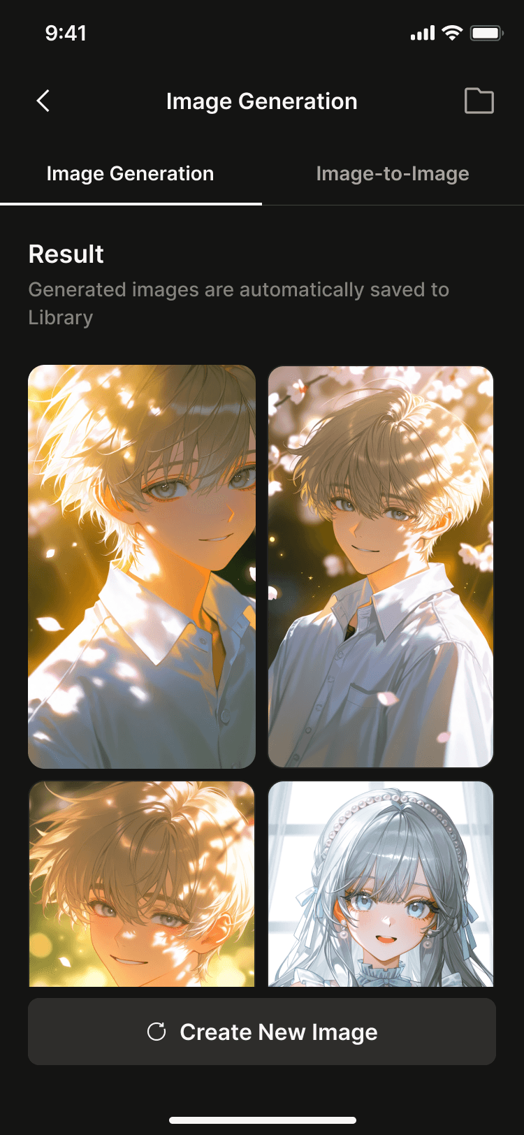
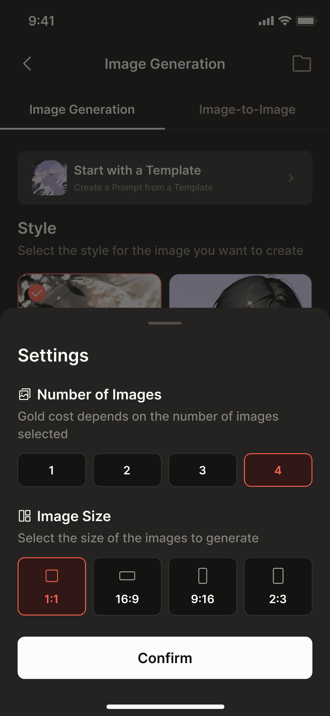
Image Generation
Style selection, image count, and prompt input
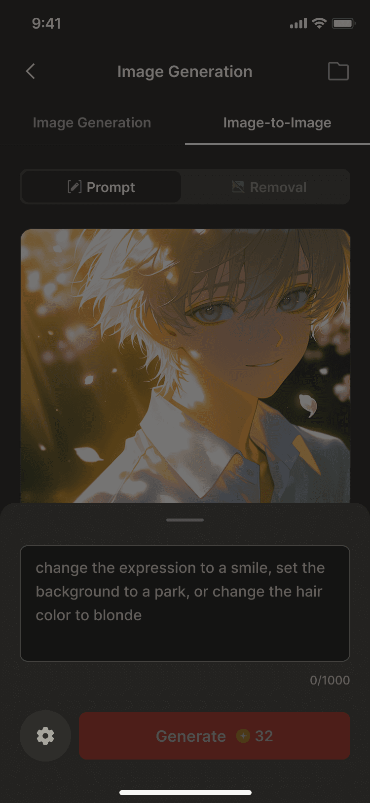
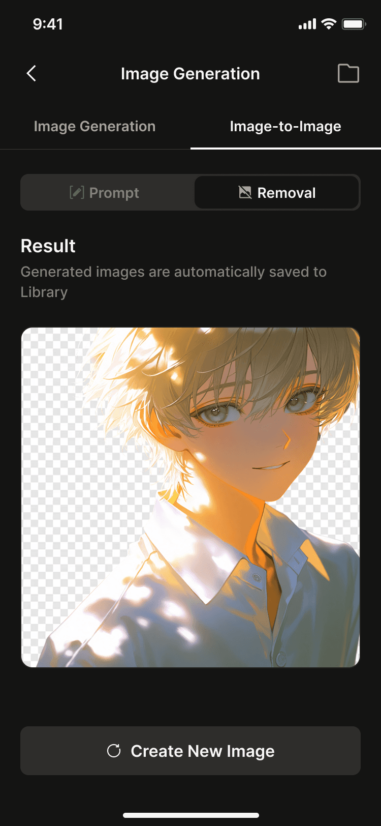
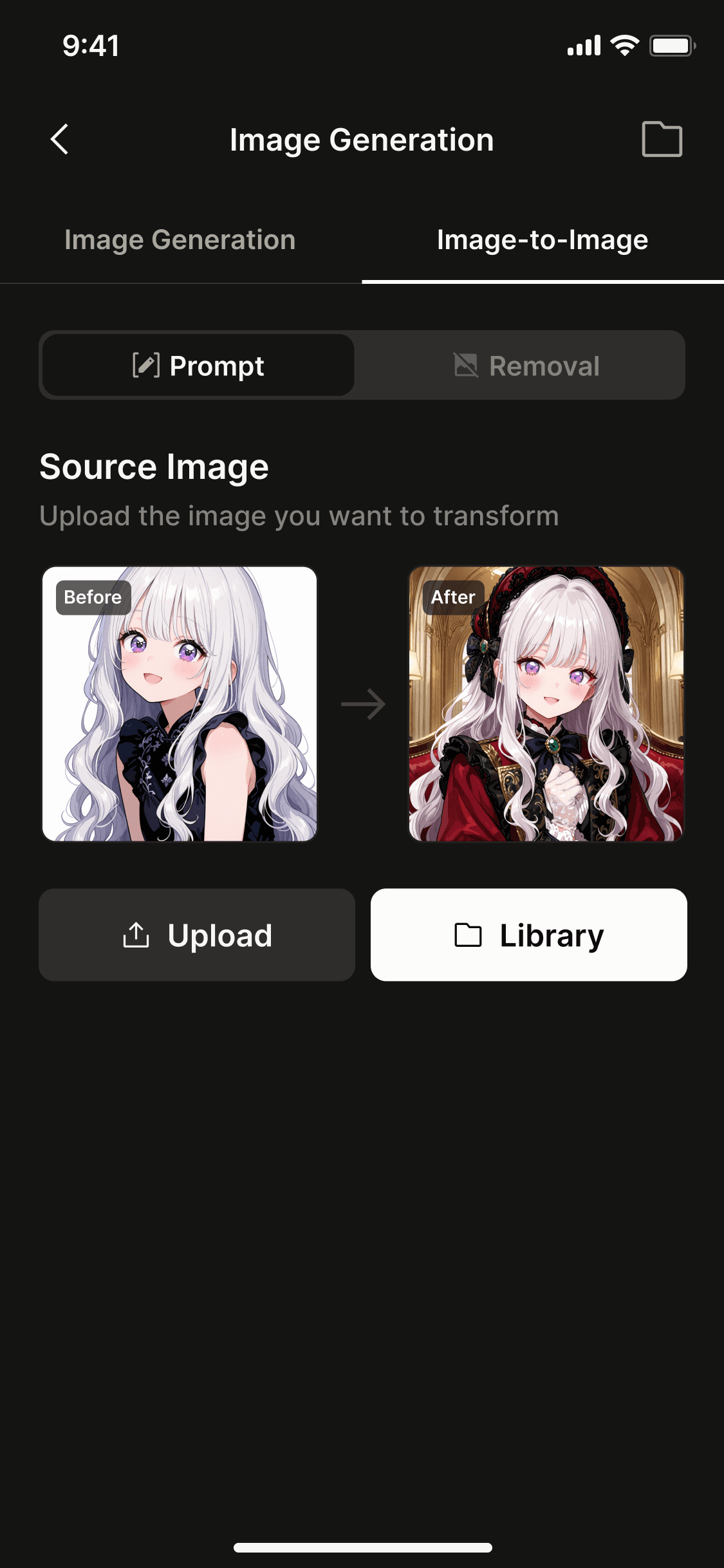
Image-to-Image
Image-to-image transformation and background removal
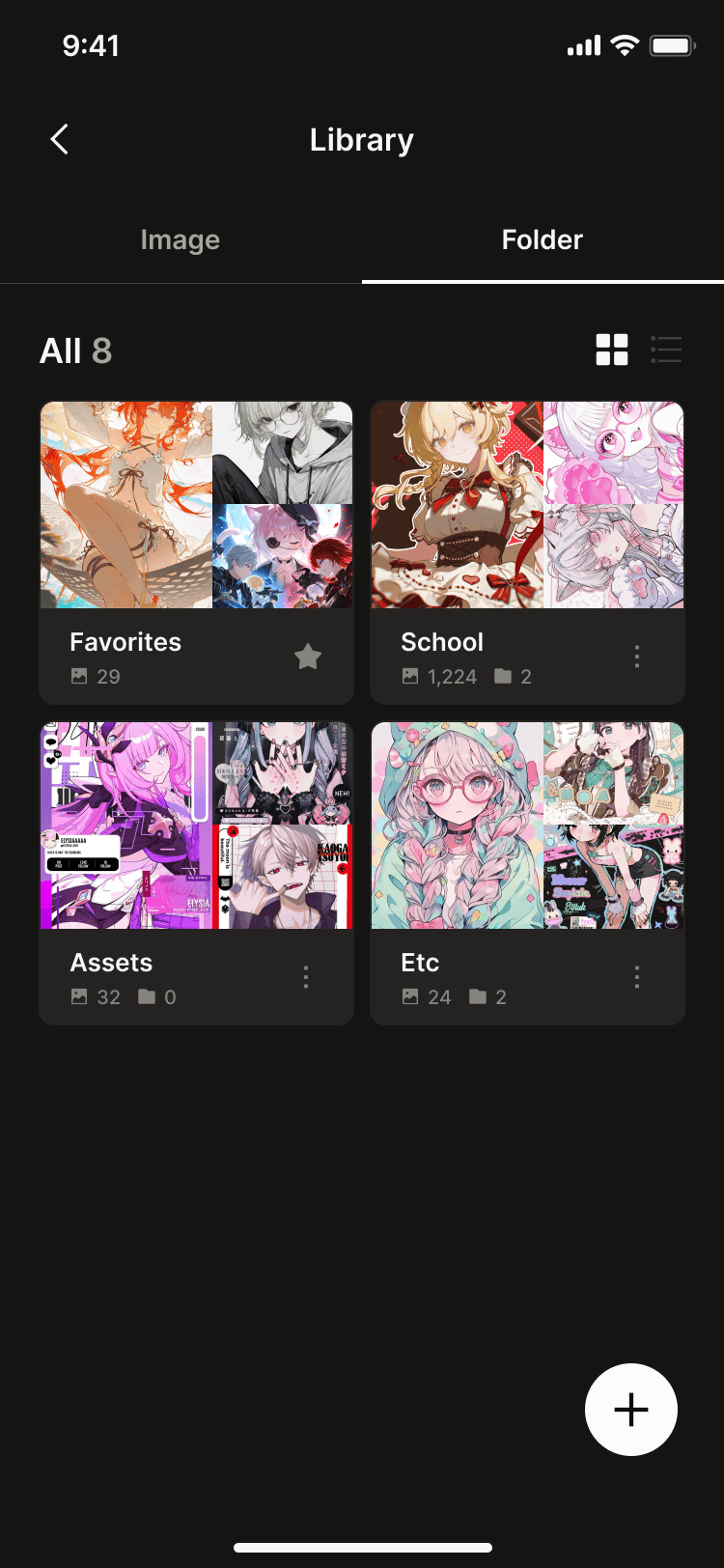
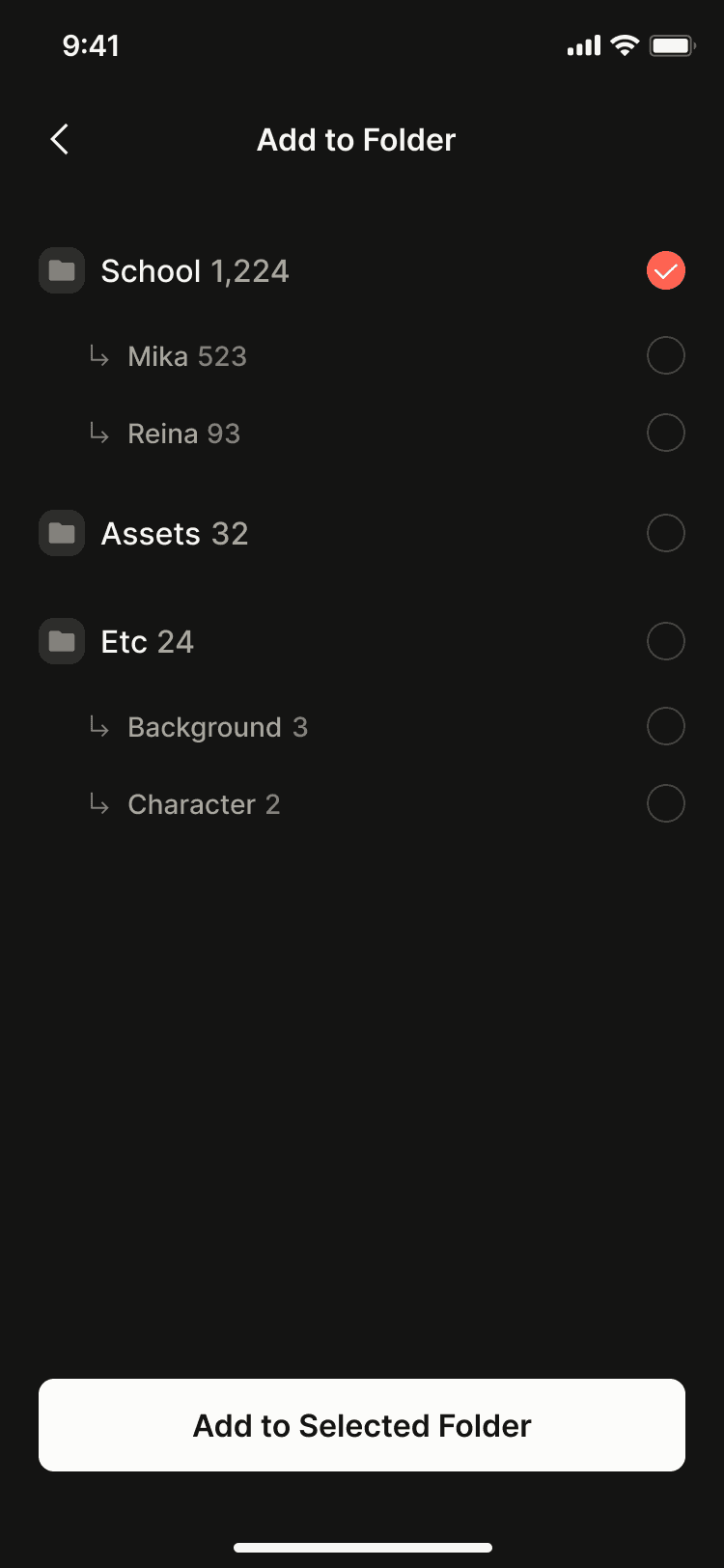
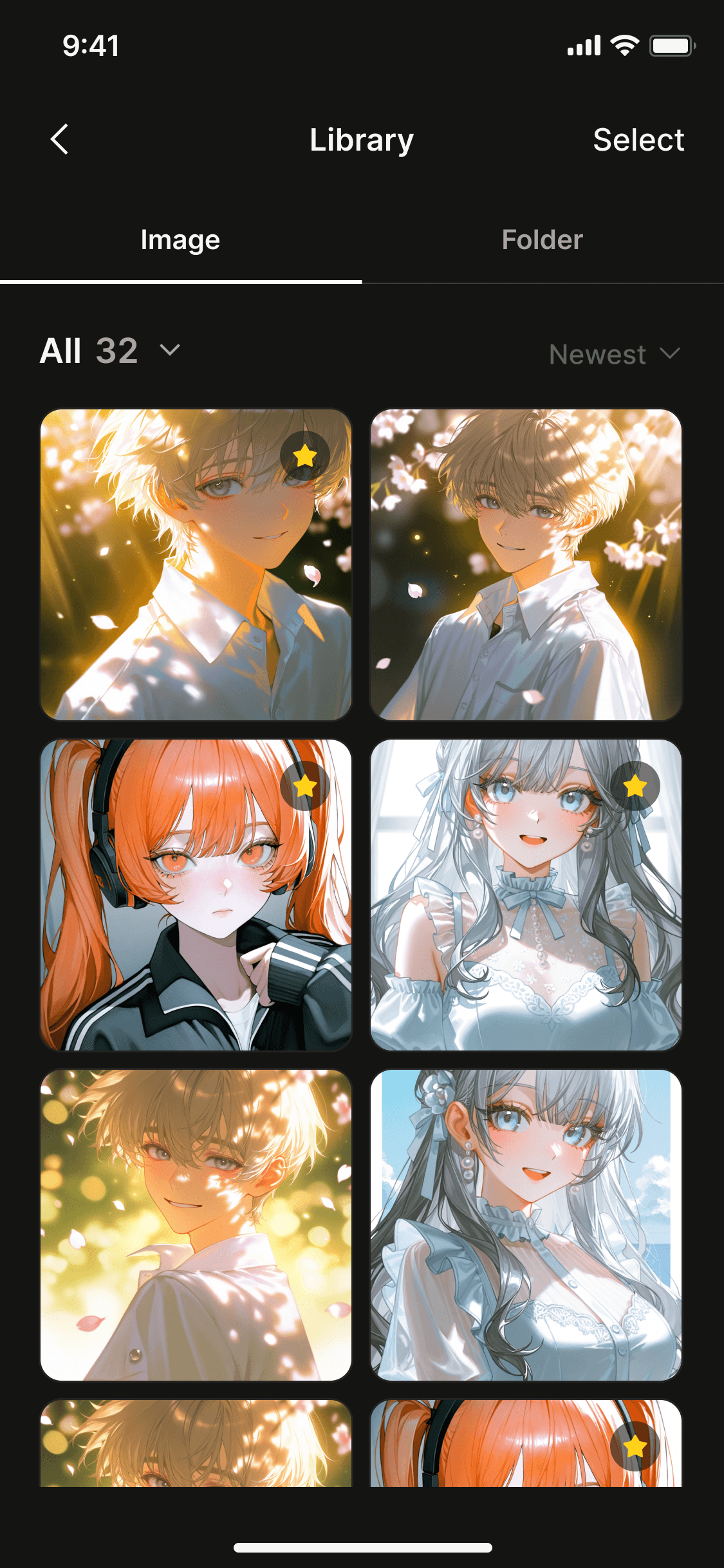
Library
Image organization, folder management, and favorites
What I did
Separated Generate and Edit to clarify user intent.
Although the two features appeared similar, they required different inputs. I designed them as separate tabs so users could clearly understand which task they were performing.
Separated Library as its own context.
Generate and Edit were treated as workspaces, while Library served as a storage space. Based on this distinction, I designed the Library as an independent area accessible from the top-right corner.Leveraged familiar mobile patterns.
For adding and removing images within folders, I referenced the interaction model of iOS Photos to minimize the learning curve.
Trade-offs
Simplified folder navigation in the mobile app.
Ideally, selecting a folder would lead to a dedicated detail view. However, due to app performance constraints, we chose to display the folder’s image list immediately upon selection.
Deferred web-specific productivity features.
Although I explored more advanced editing workflows optimized for desktop, most paying users were concentrated on the mobile app, so we prioritized the mobile experience first.
Impact
Although still in the early stages after launch, we have already observed several positive signals.
Increased
Image Generation
Higher
General User Engagement
Reflection
Personas shape information architecture.
Clearly distinguishing users with different goals made it possible to design a more intuitive and natural product structure.
Great UX is built within real-world constraints.
Finding the right balance between technical limitations and business priorities was a critical part of the design process.Familiar patterns reduce the learning curve.
Leveraging interaction patterns users already understood proved more effective than introducing entirely new behaviors.